Diagnosis Guidance Solution

Diagnosis Guidance Solution

User workflow Redesign

User workflow Redesign

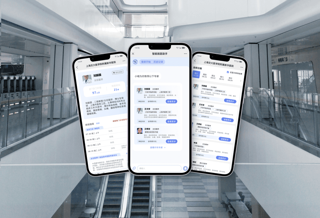
This is a redesign challenge I did for a diagnosis guidance mini-program of Xinhua Hospital, which is empowered by SenseCare, a AI-driven platform.

The workflow I worked on aims to enable patients to have online pre-diagnosis and book the right appointment, thereby improving the efficiency and experience of seeking medical care.

Solution

Diagnosis guidance solution

Solution

Diagnosis guidance solution

What I did

Function redesign
Heuristic UI/UX audit
Interactive prototyping

What I did

Function redesign
Heuristic UI/UX audit
Interactive prototyping

Duration

3 days

Duration

3 days

Part 1 Heuristic Analysis

Part 1 Heuristic Analysis

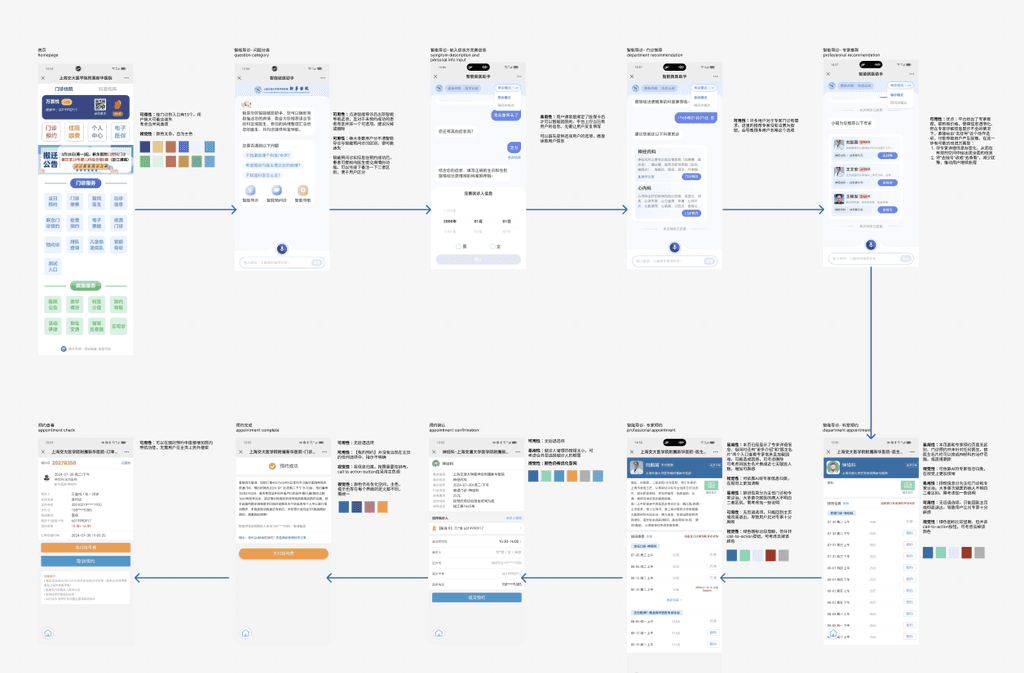
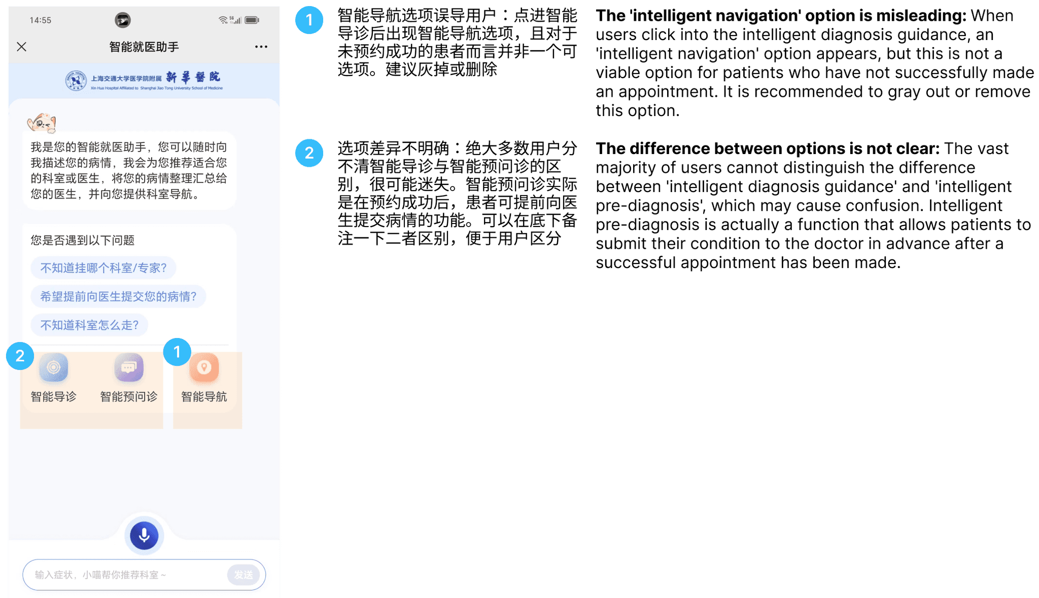
As a person who has not experienced this workflow before, I explored the whole process as a user.


In the process, I did discover some points that could diminish user experience and aesthetic appeal.

As a person who has not experienced this workflow before, I explored the whole process as a user.


In the process, I did discover some points that could diminish user experience and aesthetic appeal.

Following are several main points discovered in user experience in every stage.


Following are several main points discovered in user experience in every stage.


Step 1 - Pre-diagnosis

Step 1 - Pre-diagnosis

Step 1 - Pre-diagnosis

Step 2 - Department & Professional recommendation

Step 2 - Department & Professional recommendation

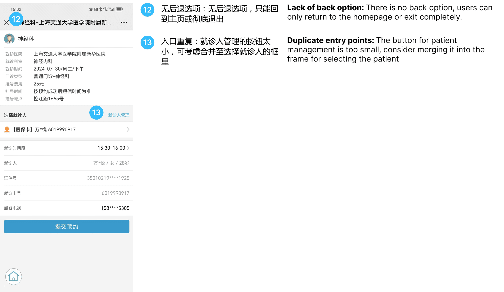
Step 3 - Make Appointment

Step 3 - Make Appointment

Part 2 Design Thinking

Part 2 Design Thinking

Before diving into ideating the new experience, I took some time understanding the user goal and pain points of the existing interface.

Before diving into ideating the new experience, I took some time understanding the user goal and pain points of the existing interface.

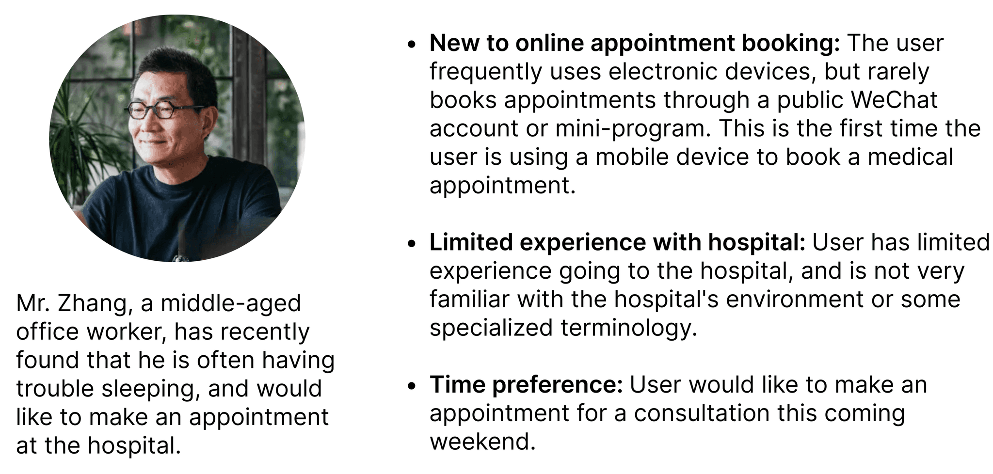
Persona definition

Persona definition

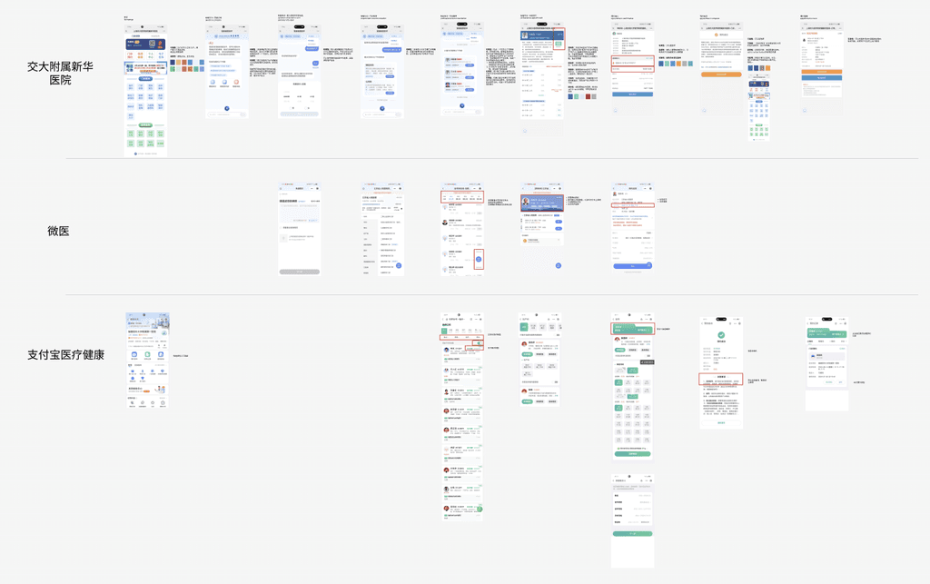
Competitive analysis & comparison

Competitive analysis & comparison

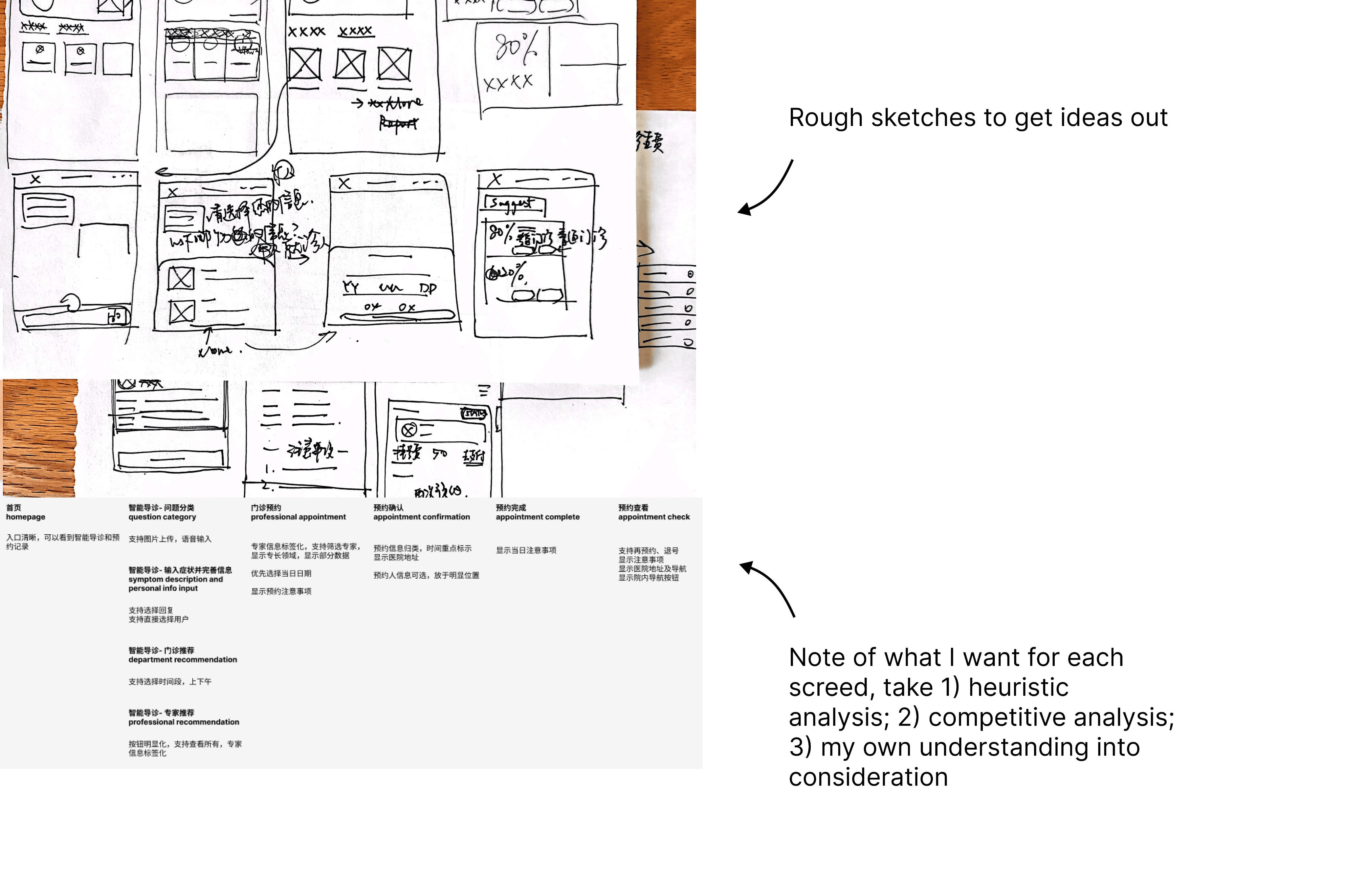
Brainstorm & Sketches

Brainstorm & Sketches

Part 3 Redesign

Part 3 Redesign

Here's a detailed walkthrough of the revamped workflow.

Reducing User Repetitive Input

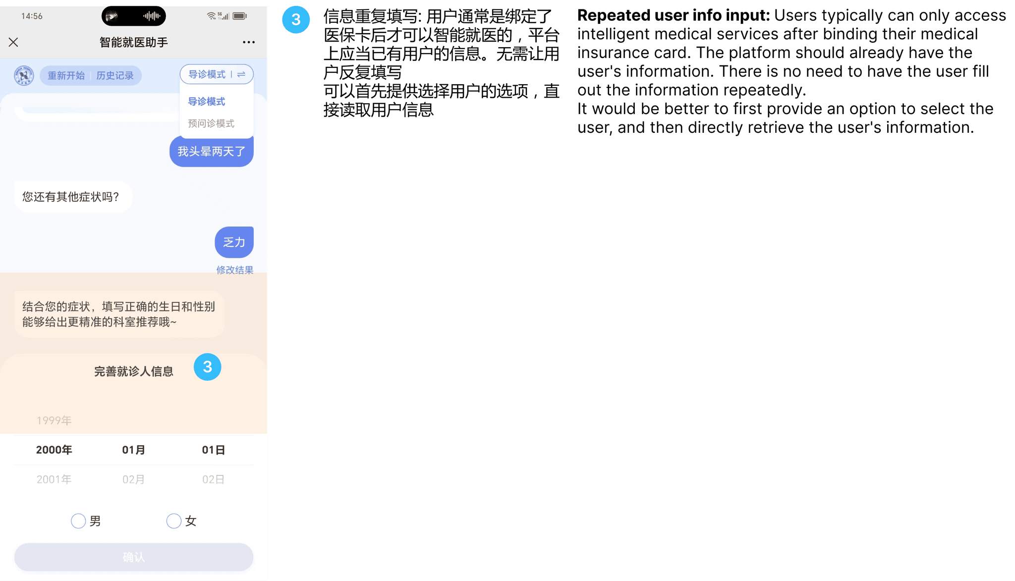
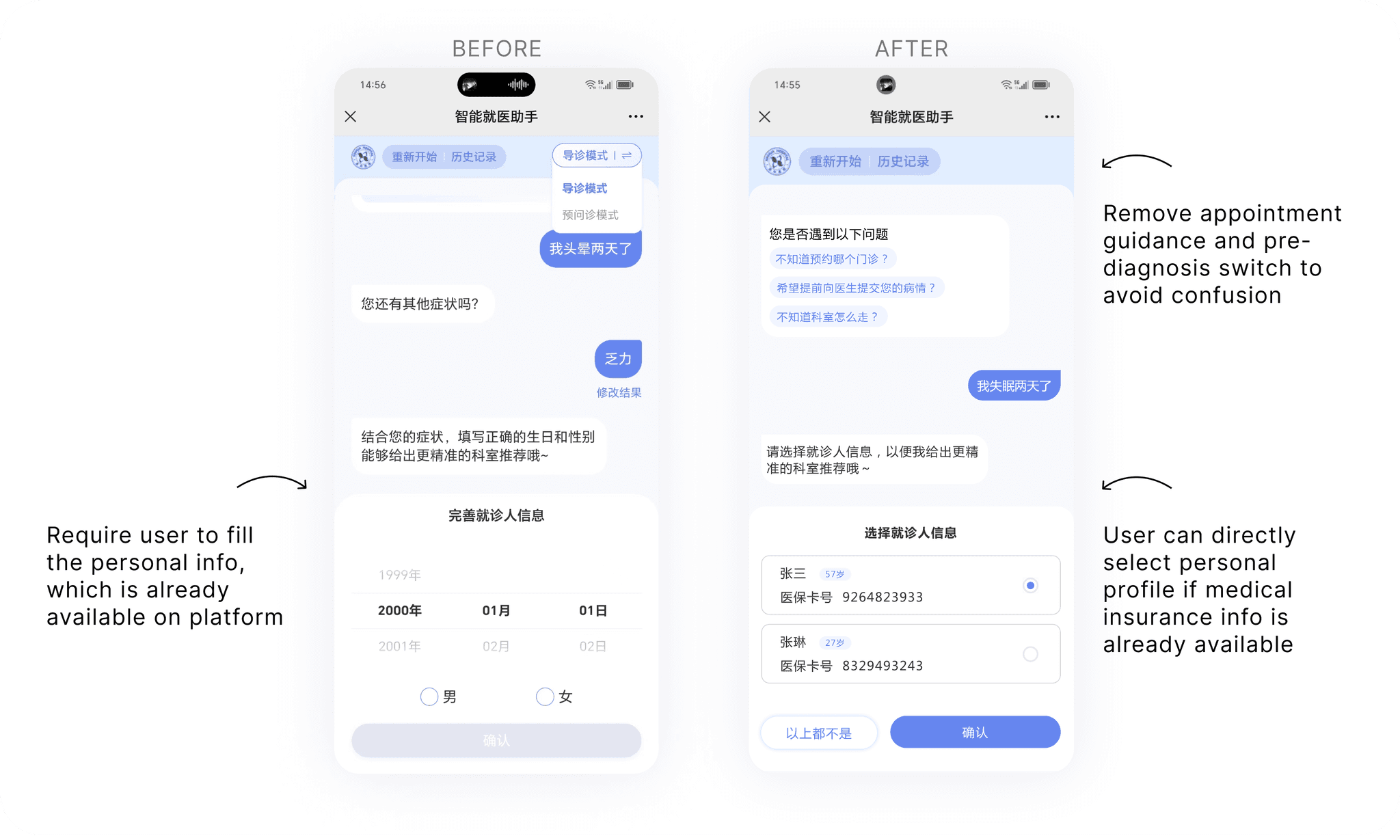
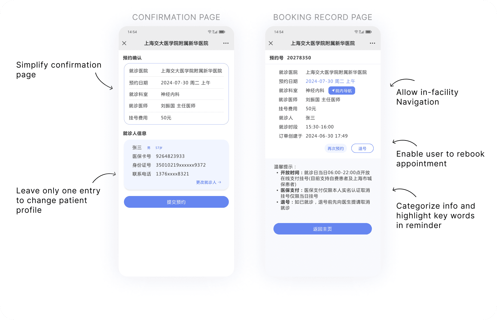
Users need to first tie their medical insurance cards to account before starting the pre-diagnosis journey, which means their personal information is already available on the platform. When AI-robot requires personal information for more pre-diagnosis, we can first allow user to select from an existing profile in order to save their time for repetitive input.
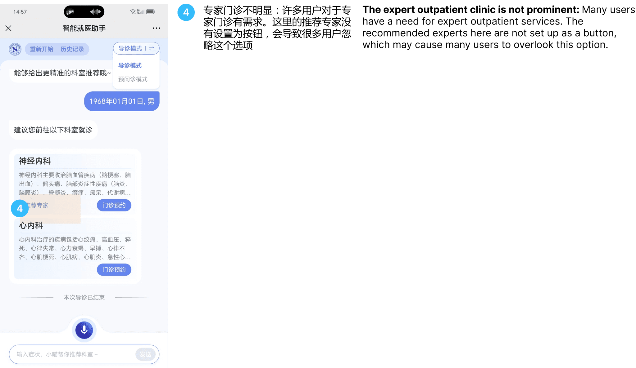
Make expert clinic option more noticeable for users

Users need to first tie their medical insurance cards to account before starting the pre-diagnosis journey, which means their personal information is already available on the platform. When AI-robot requires personal information for more pre-diagnosis, we can first allow user to select from an existing profile in order to save their time for repetitive input.
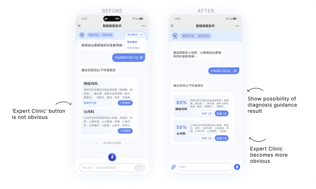
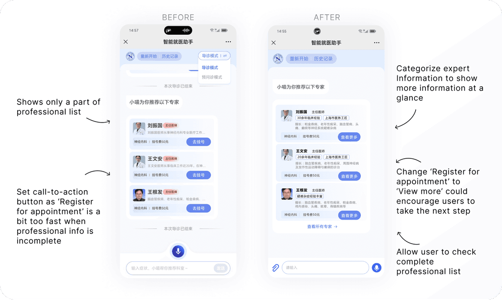
More complete and easy-to-read expert information

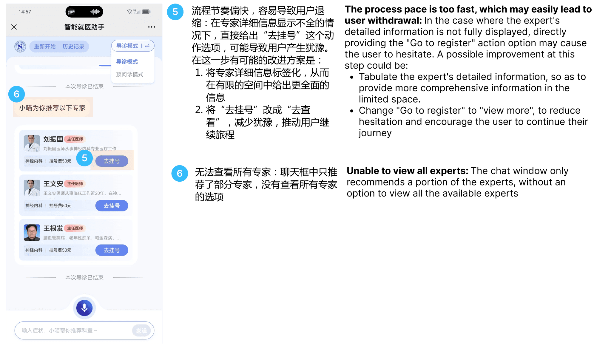
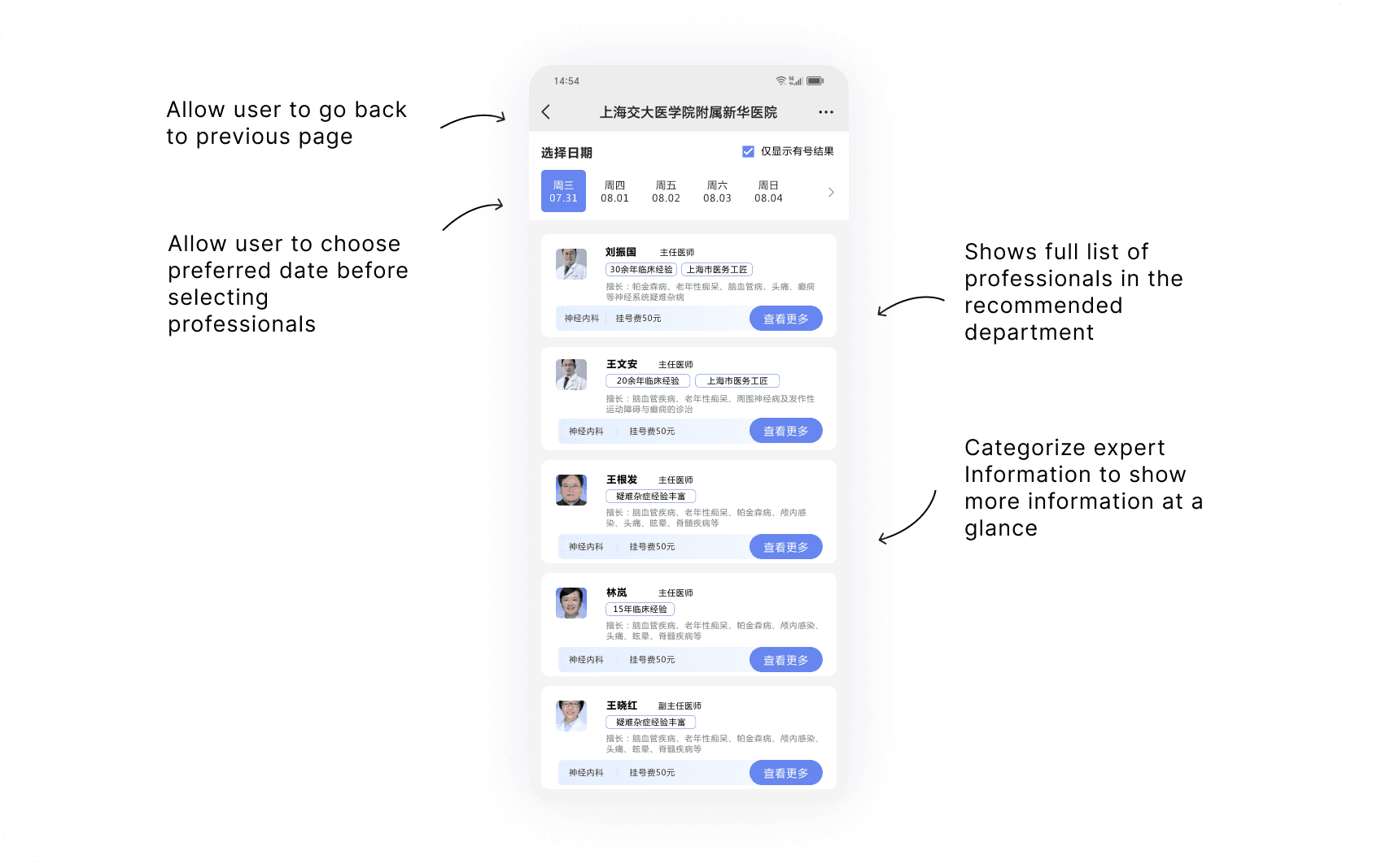
Expert information are formatted in labeled sections in the future design, emphasizing the expert's personal attributes to make comparison easier. Besides, I changed "Book Appointment" to "View More" to reduce user hesitation and encourage them to continue their user journey. In addition, future design also supports users to view the complete list of experts.

Make expert comparison easier

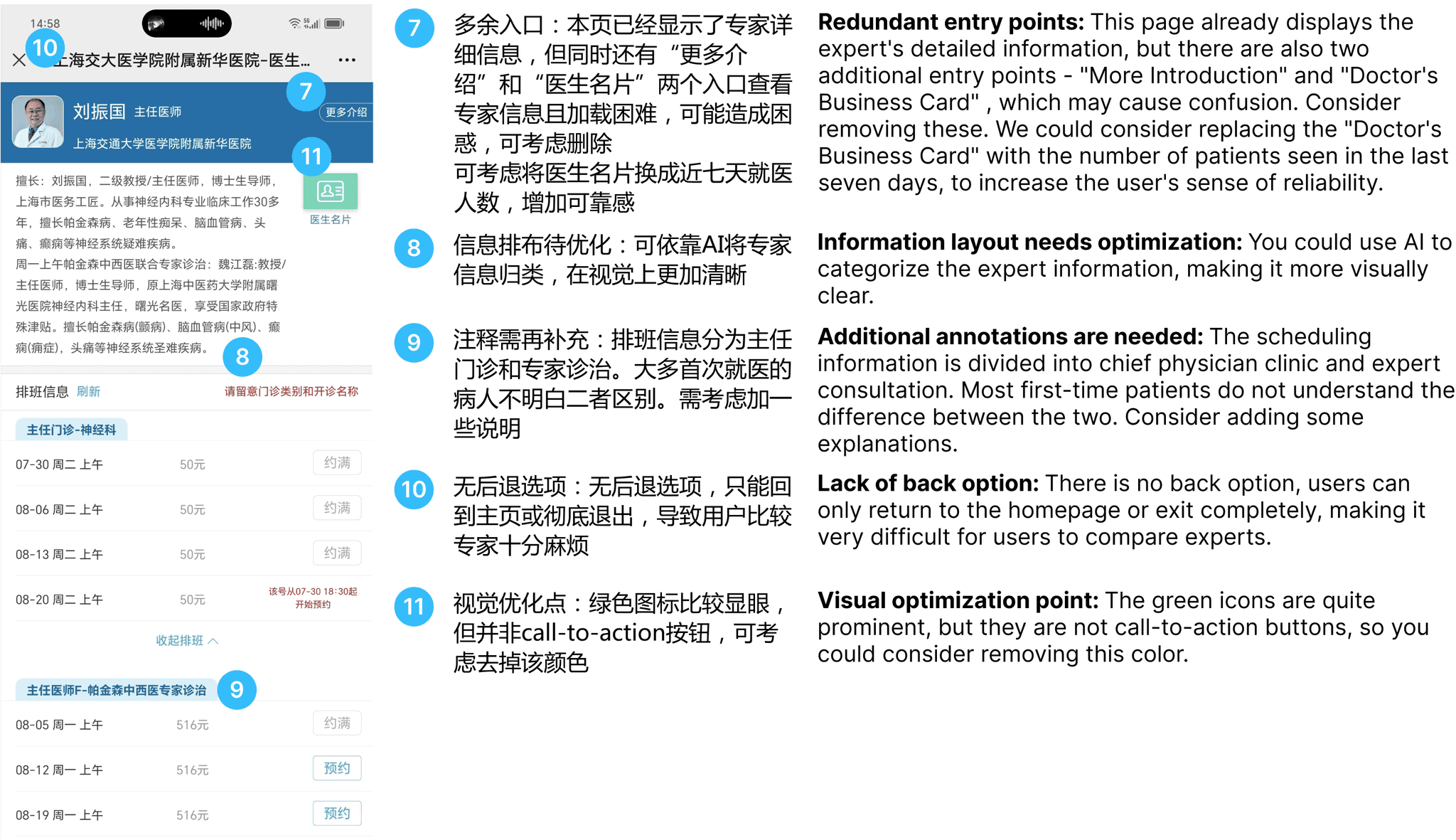
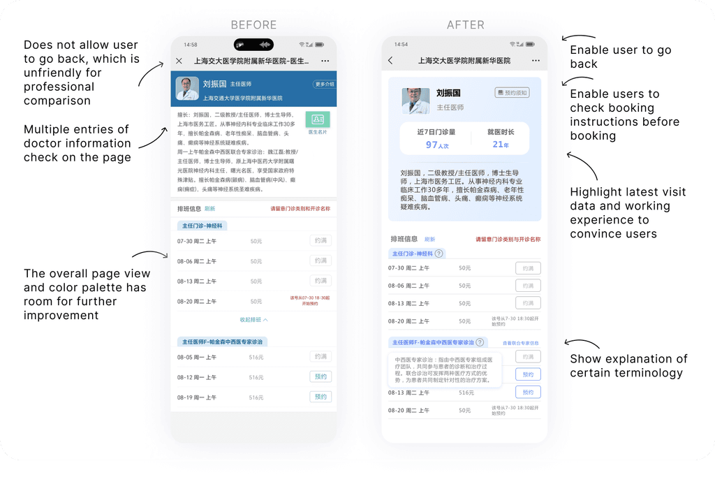
Current version does not allow user to return to previous 'expert recommendation' page, which makes it very inconvenient for users to check and compare experts. Therefore, back option is set on every page in the redesigned version. Besides, user-relevant Information is highlighted on the expert booking page to help users filter experts.
Additional page: enable user to check expert full list

In current version, user cannot check all experts under the robot-recommended department. In the redesigned version, we added a new page to show the full expert list and enable users to select their preferred date for filtering, which is an effective for office workers who need meticulous time management.
Allow in-facility navigation and re-book functions for appointment

After making appointment, users can check their booking records in user profile. Besides cancellation, user can also rebook appointment and have in-facility navigation on visit day.
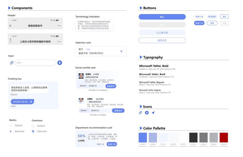
Design System
Part 4 Research Plan

Part 4 Research Plan

For this project, I set myself a 3-day challenge timeline. During this time, I primarily focused on analyzing the user journey and redesigning it based on the user personas I had defined. This allowed me to improve the end-to-end flow from pre-diagnosis to department recommendation to appointment booking.


The next step will be to conduct user research on the improved user journey. This will help ensure that my design is applicable and effective for a broader user group.

Next project

Next project

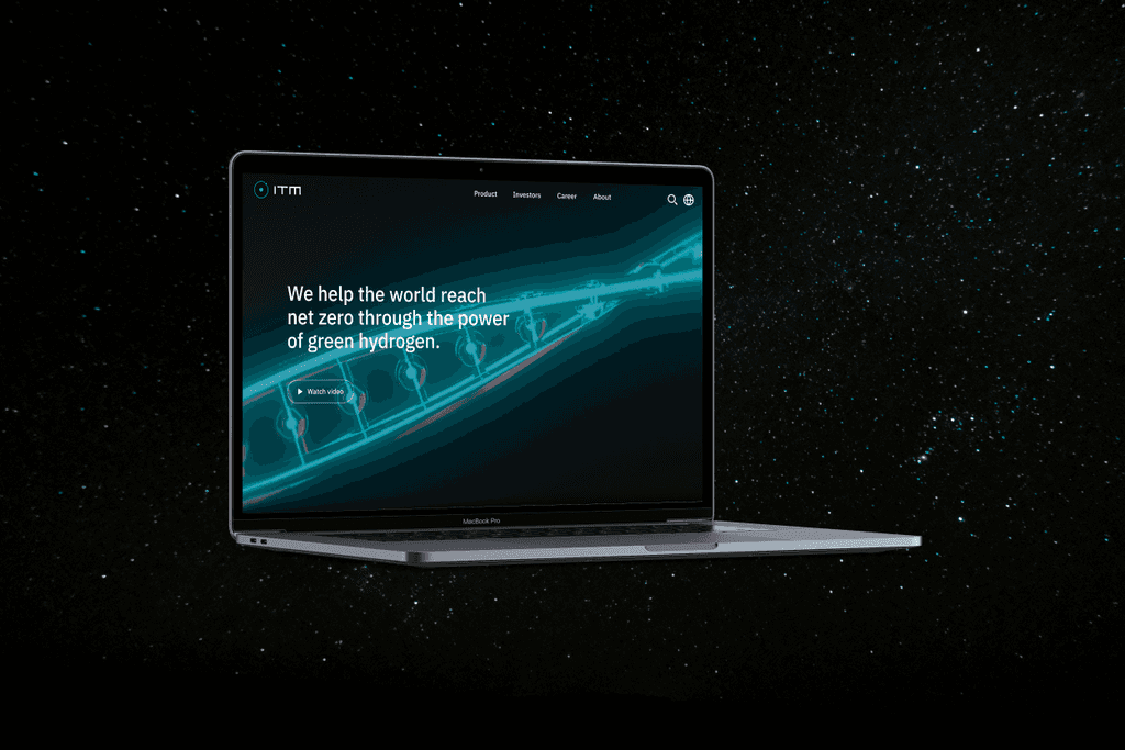
Webpage Redesign for new energy company

Webpage Redesign for new energy company

Sneak Peak

Sneak Peak

Let's talk

Drop me a line

Let's talk

Drop me a line