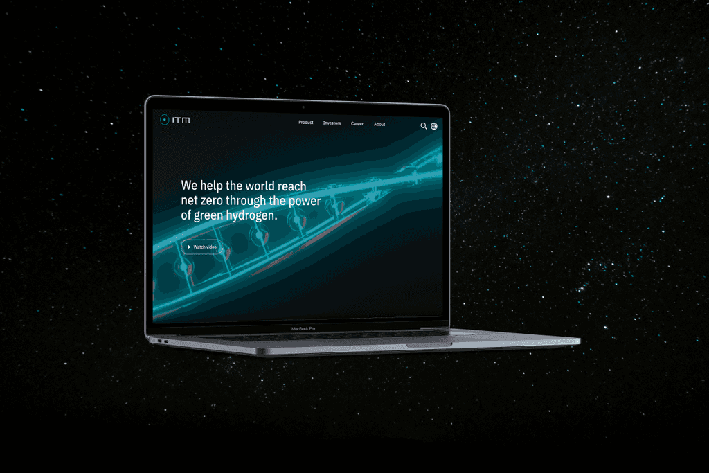
As I browsed through their webpage, I came across a few issues:
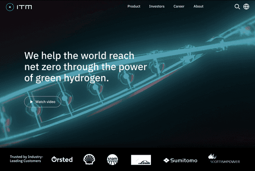
The hero section lacks clear messaging about the company's core business.
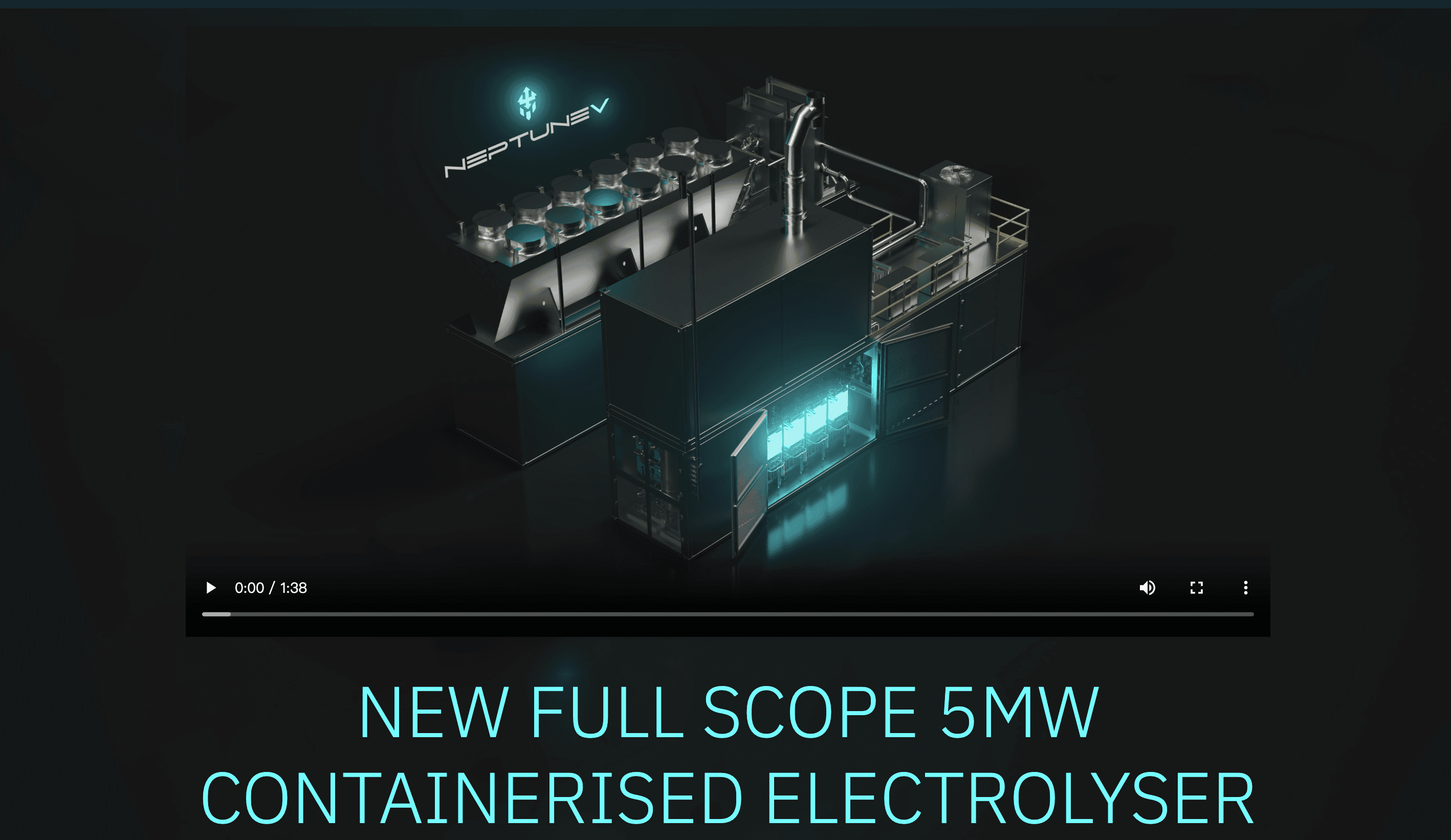
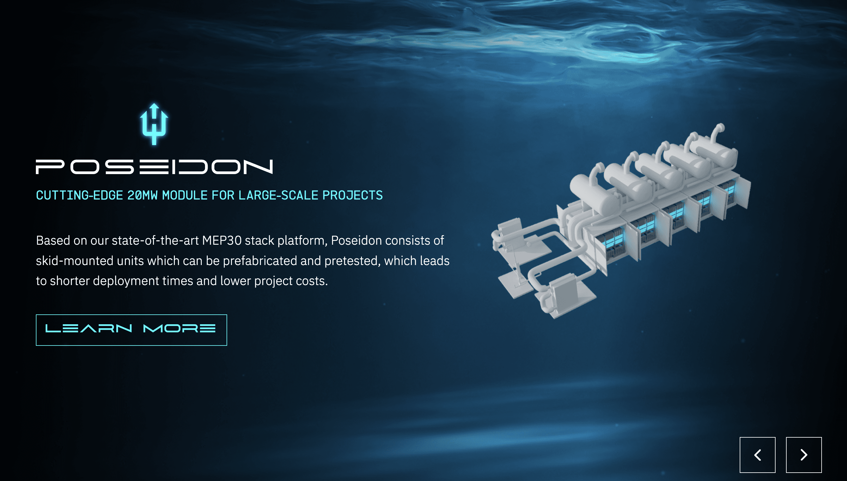
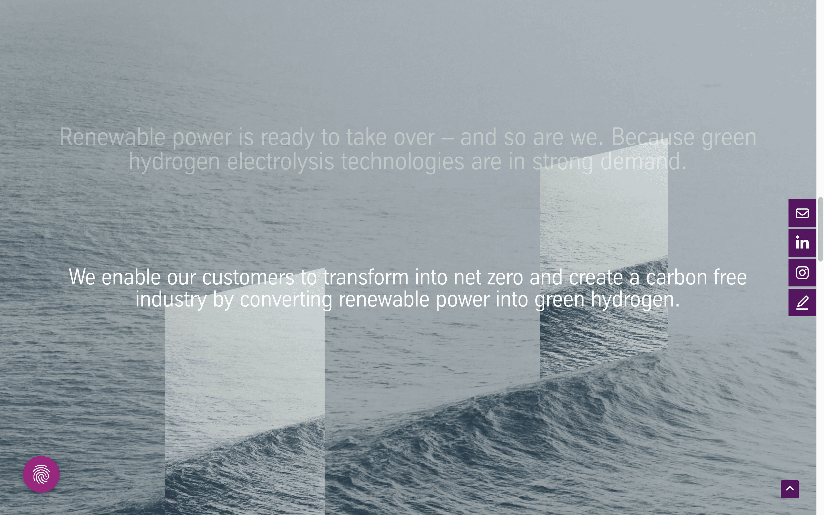
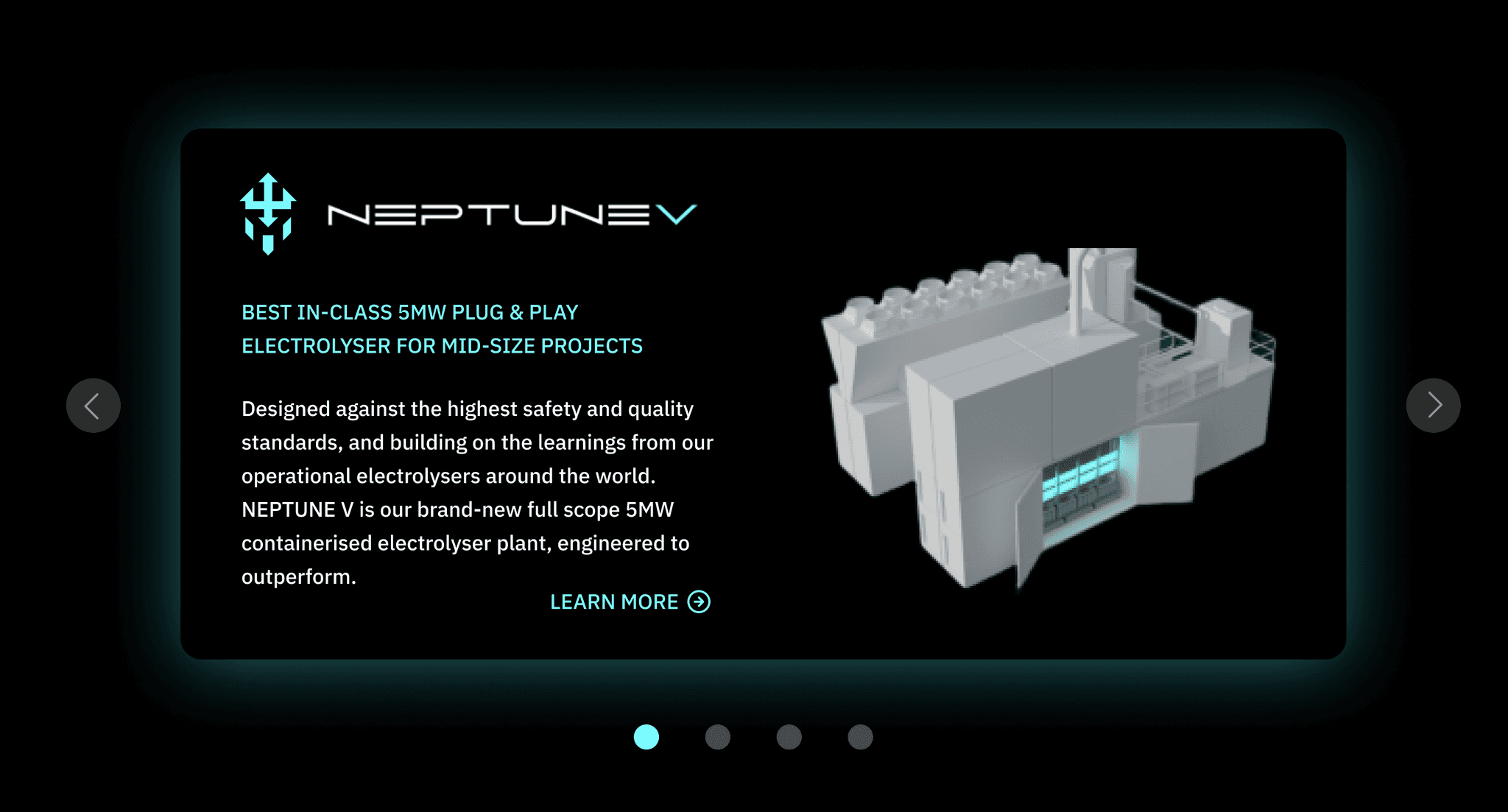
The overall webpage design lacks visual consistency, with the top and bottom halves feeling disconnected in their aesthetic approaches.
The color palette, especially the pairing of mint green and blue, does not feel cohesive or well-coordinated.
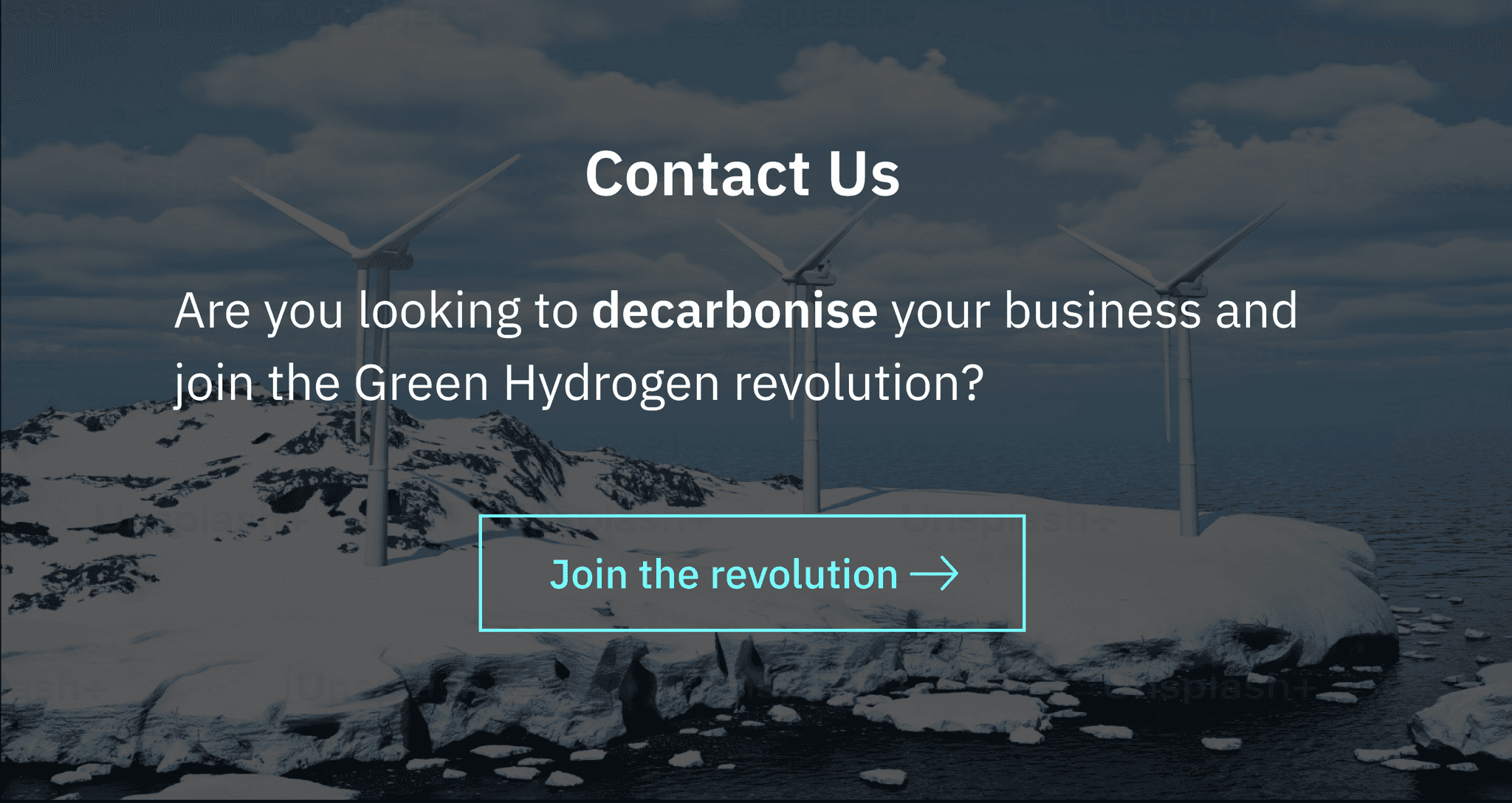
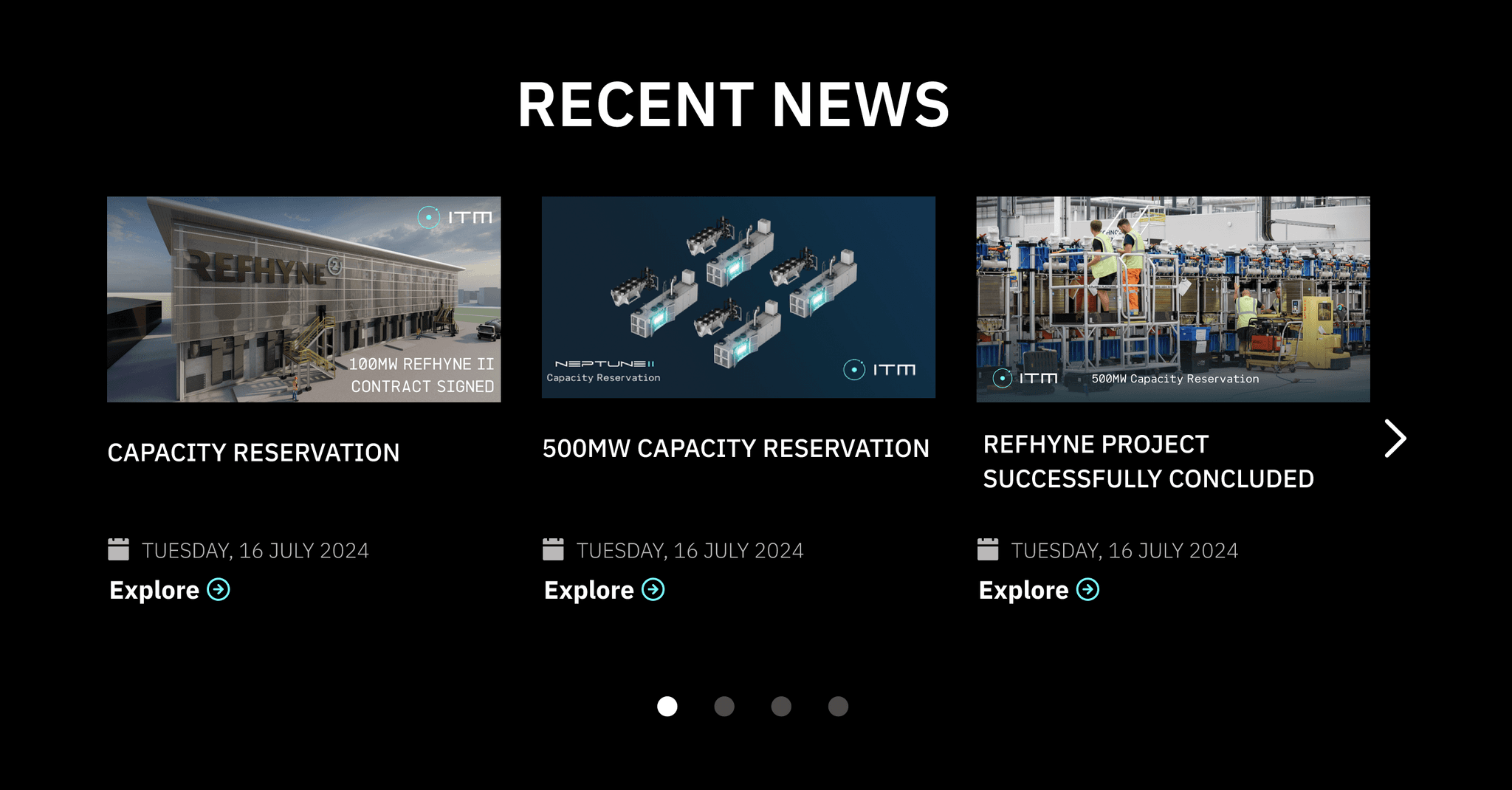
SECTION REVIEW : Webpage has a bit of an inconsistent visual style between the top and bottom halves.
Top half:
embraces a stronger futuristic aesthetic, centered around a refreshing mint green color palette
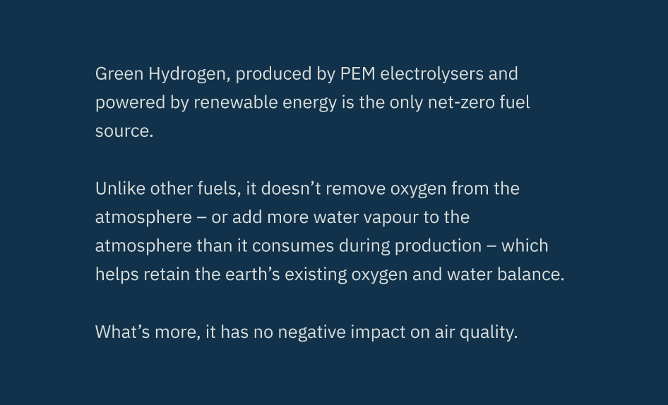
Button half:
takes on a more minimalist, streamlined approach, primarily utilizing a solid blue color scheme
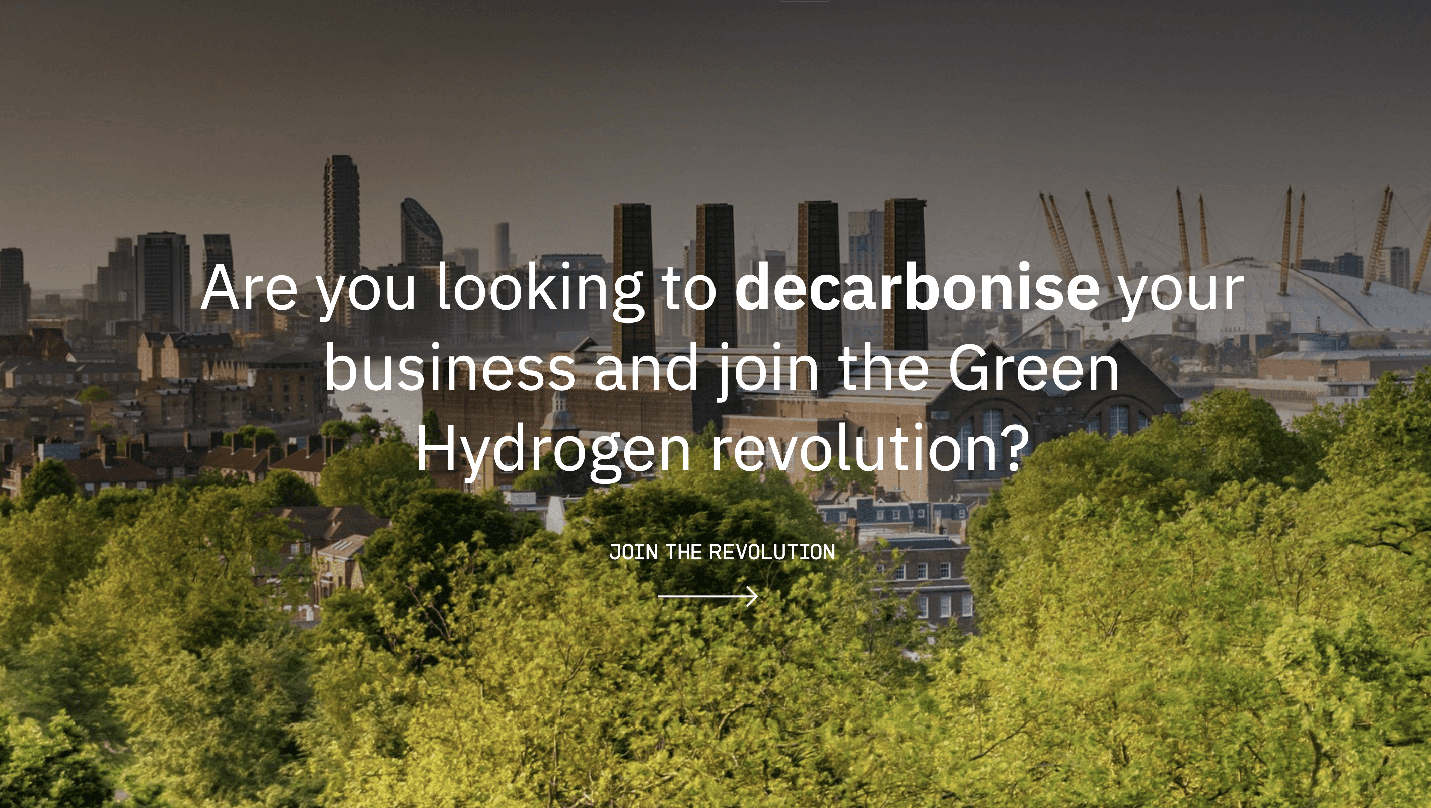

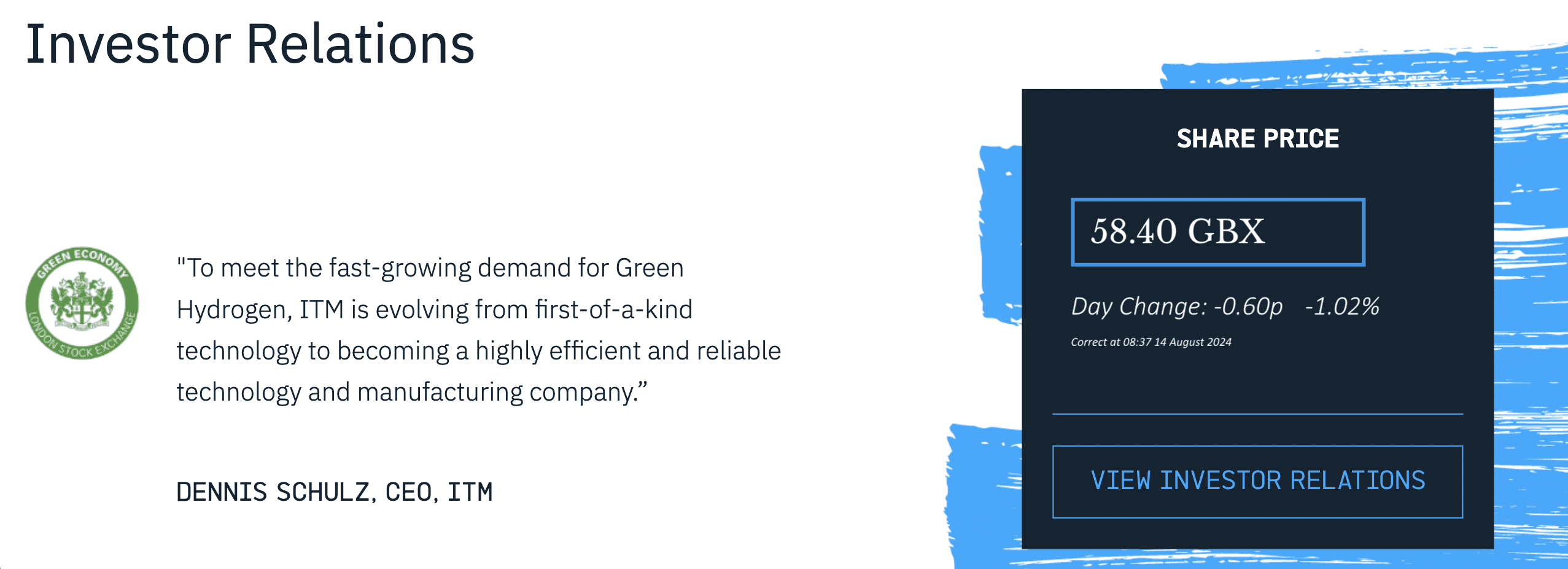

COLOR REVIEW: Color palette contains more than one primary colors
1
2
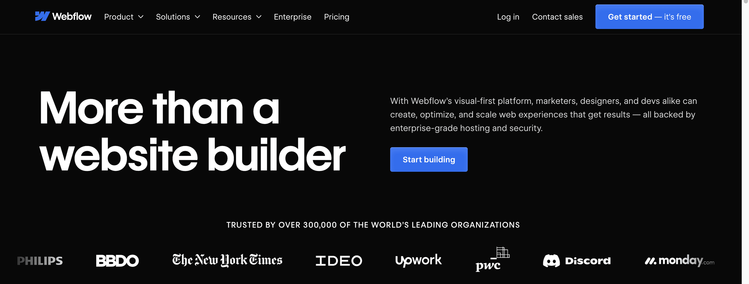
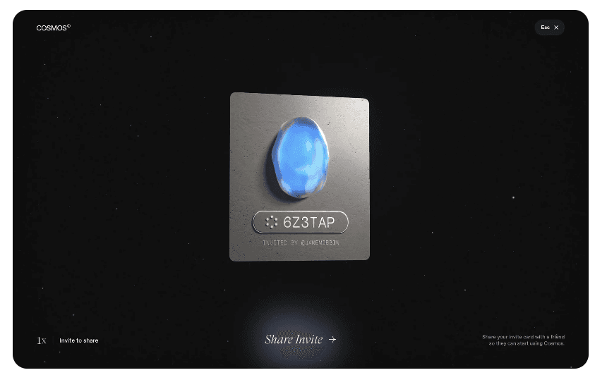
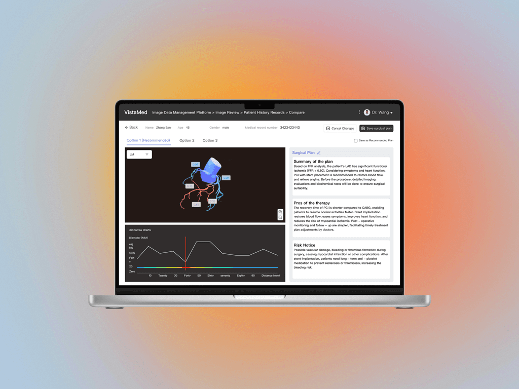
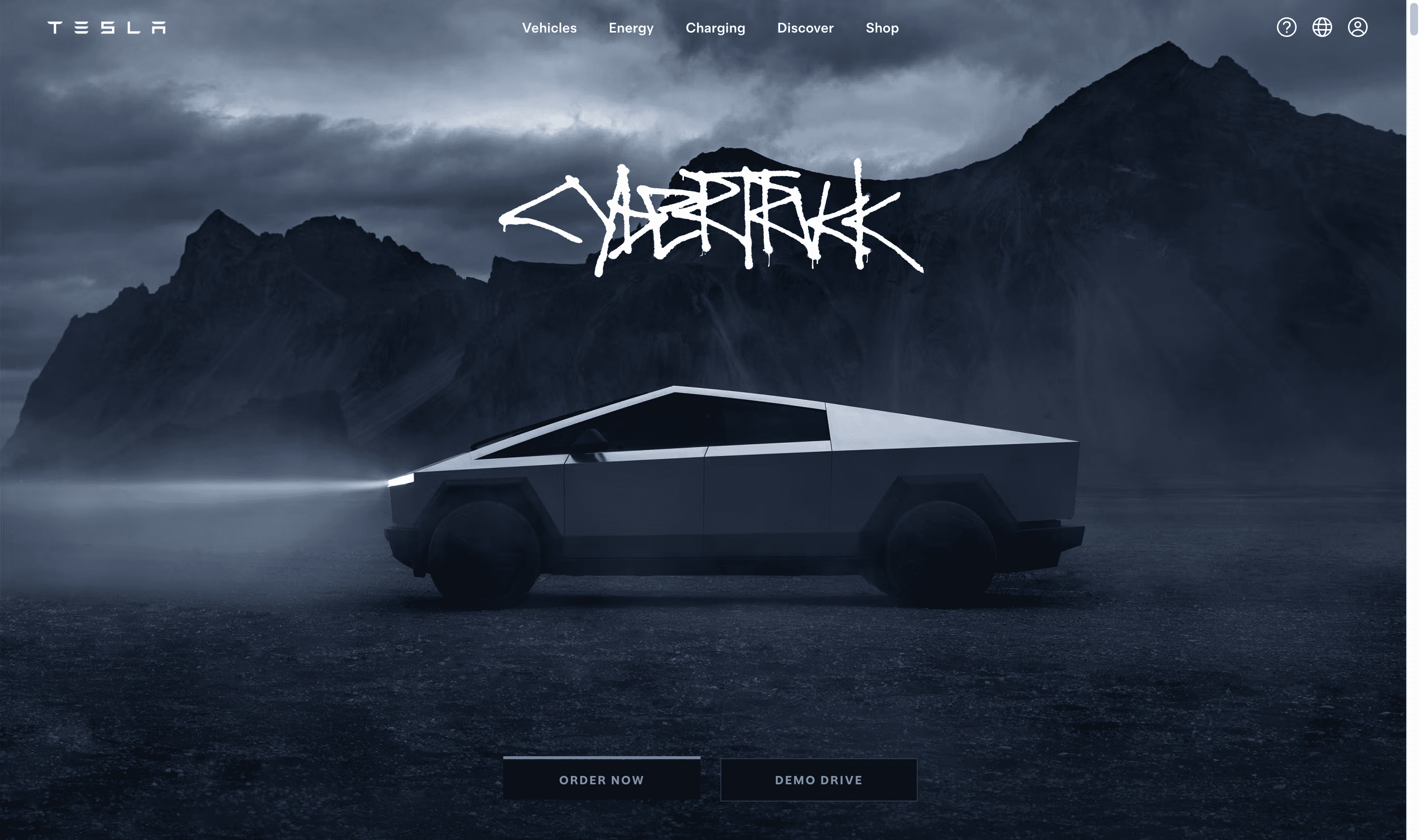
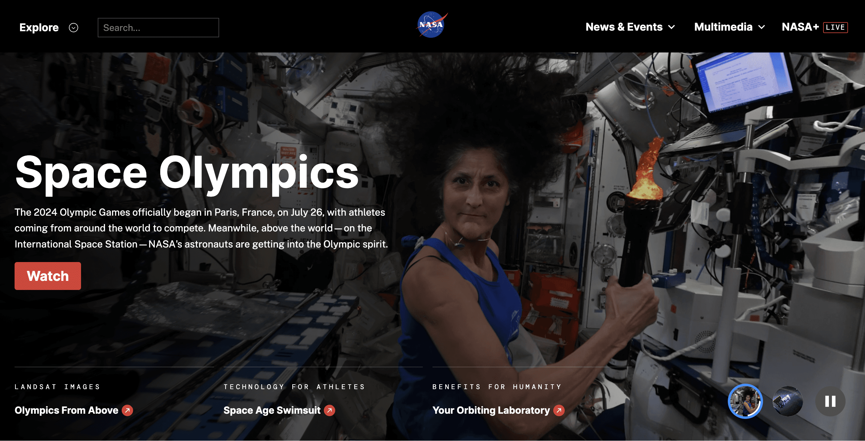
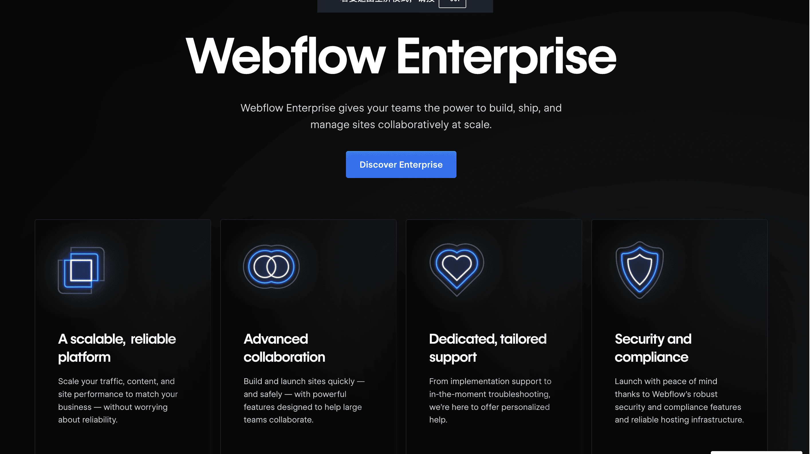
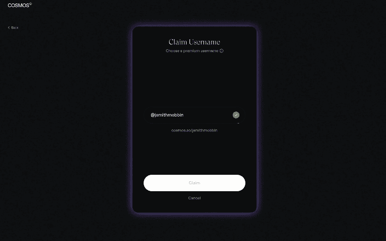
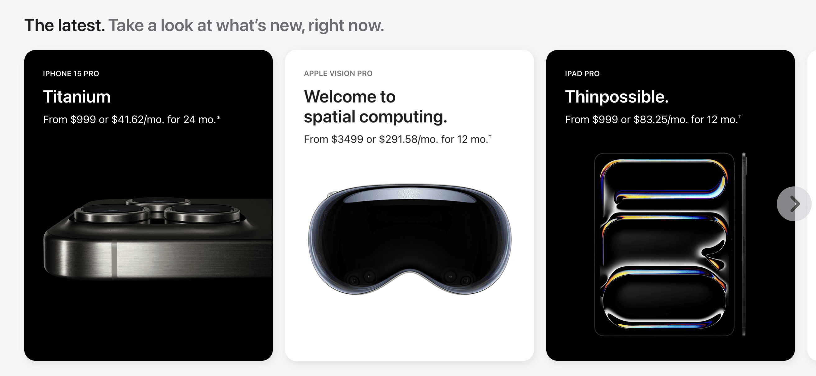
To align with the futuristic theme, I've found some dark-themed UI elements and materials featuring a lot of metal and technological components. I will be using these as references for the redesign.



Intelligent Imaging Diagnostic Platform
